• About the course
  • Syllabus

AMST2661 Visualizations in the Humanities

~ Projects and thoughts to share with the class

AMST2661 Visualizations in the Humanities

Author Archives: nicolemeehan

Process as value

16 Saturday Nov 2013

Posted by nicolemeehan in weekly writing

≈ Leave a comment

Tags

3d print, 3D visualization, digital humanities, Smithsonian, visualization

Definition of 'maker'

Use of the term ‘maker’ to describe the 3D printing community was one I was not aware of.  I think it is interesting to consider the word in this context alongside the definition above.  As Neely and Langer quoted from The Economist in their article Please Feel the Museum:  The Emergence of 3D Printing and Scanning, “The maker movement is both a response to and an outgrowth of digital culture…many people who spend all day manipulating bits on computer screens are rediscovering the pleasure of making physical objects”.  This return to materiality seems to be slightly odd to me.  Many of the examples in this weeks readings show makers creating miniature version of sculpture, or even integrating different sculptures in a mash-up, however these are missing their initial textural element.  They may be as accurate as possible in terms of form, but in terms of texture they are all the same, which was obviously not the case in the past.  

I agree that 3D printed objects are useful for all of the reasons outlined in 3D Scanning in the Museums:  A Q&A with the Smithsonian’s “Laser Cowboys” but I do think they miss something.  I think their value is in their process of creation, perhaps, and not the result.  Here is an example of an artist, Gilles Azzaro who has confronted sense to a certain extent – he has created and printed a visualization Barak Obama’s State of the Union address.   Pressing the ‘start button’ plays a recording of the speech and a laser tracks progress through the speech upon its 3D printed counterpart.  Again it is the process that is of interest here, and the fact that it took 350 hours to print.

3D print of Obama's State of the Union address

Something else I considered was how our interpretation of an object is formed partially from our knowledge of how it was created.  As a former archaeologist this is an incredibly important part of how we understand objects, and so I wonder how 3D printed object will be viewed by the archaeologists of the future?

Layers of interpretation

10 Sunday Nov 2013

Posted by nicolemeehan in weekly writing

≈ 1 Comment

Tags

archaeology, digital humanities, Immersion, museums, visualization

I felt a sense of frustration in Bonnett’s 2003 article Following in Rabelais’ Footsteps:  Immersive History and the 3D Virtual Buildings Project.  Whilst he perceived the benefits of using a 3D environment to teach students to confront the issues associated with creating visualizations from an incomplete historical record, it was clear he thought the technological limitations were restricting its potential.  Has access to immersive realities changed in the past decade?  We do see them feature ever more increasingly in the museum setting but as for the classroom, I am unsure.

I think once more we are faced with the question – do visualizations teach us anything new about our research, anything we do not already know?  In most cases I do not think it does.  But I do see potential, for example in reconstructions of ancient cities we can decipher new correlations between building and monuments that may not have been obvious before.  Here I mean in terms of sight lines and settings (as researched by Elizabeth Marlowe in Ancient Rome), the connections that would have been assumed by people in the past, but are not necessarily obvious now.  Of course, it takes vast resources to build an environment that would be conducive to making these discoveries, something that the digital humanities often lack.  And so maybe Marlowe’s architectural drawings are an easier way of demonstrating her theory visually.

There is another issues to be considered, relating to the interpretations we make during the 3D visualization process, both in computer and caved based cases.  We experience virtual realities that have been created by another’s perception of a past reality, we look through their eyes, so to speak.  It seems to me there are many layers of interpretation involved in creating such models – for example in reconstructing a historic building, there are interpretations made concerning the difference between the plan and the building that was actually constructed, interpretations of the gaps in the historical record and how they should be presented, interpretations made by the designers of the interface which frames our visualization and so on. As Diane Farvro mentions immersive realities necessitate the addition of “aural and kinetic” layers which will add yet another layer of interpretation.  How can we hope to recreate the sound and textures of the past accurately?  However despite the associated issues we push on, and I think we are right to do so.  Humanists work within a society that is increasingly connected to 3D representations in advertising, gaming and film, to mention a few.  An expectation has been created and the humanities must keep up.

Text – Image – Digital

04 Monday Nov 2013

Posted by nicolemeehan in Uncategorized

≈ Leave a comment

The idea of Text is changing and has been for some time.  The shift to digital should influence how we study text within the humanities.  It is no longer the sole focus or central node of research.  Text is experienced through different interfaces and placed within these interfaces by different programs.  The decisions taken during the process of displaying text digitally are essentially a curation of data, what is being displayed, how is it arranged on the page, what interpretation is offered, what interface/program is used and how do we need to manipulate our text in order to fit into it?

I think this is an interesting question; do we change our text in order to create a digital representation of it? Or do we alter the programs we use to display it?  Or a mixture of both?

I found the Manuscript Average fascinating.  It highlighted the arrangement of text on the page and prompted questions of how this influences the way we read.  I wonder how this would look if compared to a modern study?  When I think about reading fiction I realise that today all of our novels are laid out in almost exactly in the same way.  However, recently a small band of authors have moved to integrated text and image more closely, and of course graphic novels are experiencing a marked rise in popularity.

Text and Image

Text and Image

What does this mean for text in these cases when it enters a direct dialogue with image. How is this transformed within a digital context?  Does an interface or program view it purely as an image?  Or is it more?

Collections – Databases

27 Sunday Oct 2013

Posted by nicolemeehan in Uncategorized

≈ Leave a comment

The idea of visualizing museum collections is problematic at best.  As Manovich describes in Database as Symbolic Form the collection is a database, its visualization is simply a window into this database.  The interface through which we experience this is a way of interacting with the database.  The objects or artefacts are classified by the curator, which is the way the museum has functioned for centuries.  We have been as Foucault puts it, set upon “an exhaustive ordering of the world” (74).  But we do so within our own social constructs and expertise, in an inherently subjective process.   This, I think may have something to do with the difficulty in establishing consistent databases (aside from grammar, spelling and nomenclature issues), which as we witness in Mia Ridge’s exploration of the Cooper-Hewitt Collections can be limiting and frustrating.

In providing an interface to museum collections we are undertaking a second process of interpretation, making connections between certain objects and placing some in particular locations.  The interface can direct users and confine their movements through the collection or allow a certain degree of control.

Any visualization of a collection is built from individual records, or blocks, the wall is the complete collection.  Thinking about ‘walls’ brings to mind Manovich’s article Data stream, database, timeline where he mentions that social networking has created a new way of experiencing data – the stream.  This is an interesting concept which I somewhat agree with.  The ‘stream’ has also offered new opportunities for data capture and analysis.  However can the museum collection be part of this?

Network Analysis – Nicole

20 Sunday Oct 2013

Posted by nicolemeehan in weekly writing

≈ Leave a comment

Tags

digital humanities, network analysis, Research

How are networks useful in the digital humanities, both at a micro (network analysis) and macro (research network) level?  Many of this week’s readings attempted to address these questions.

Scott Weingart cautions us to use network analysis wisely, and I think he is right.  There is a tendency to jump on the new-tool-bandwagon, regardless of how useful it may be for particular types of research.  However, there are many cases where network analysis can, and should, be utilised.  As Manual Lima says of the visualizations on his VisualComplexity site  “all projects have one trait in common: the whole is always more than the sum of its parts”.  How can humanists know when it is appropriate to use network analysis?  I think the only answer to this is through education, we need to be able to fully understand questions such as; what exactly is network analysis?  What is the underlying theory?  What are its limits?  Weingart tackles this adeptly in his Demystifying Networks blog post.  I found it useful that he stressed the limitations of the algorithms behind the analyses, making it clear that two different types of edges, directed and undirected cannot be represented within the same visualization meaningfully.  Much of what Weingart describes would be implicitly understood in ‘real life’ but are important to consider and address in network analysis.

The second idea of networks, the macro, that the digital humanities needs a defined global scholarly network is a logical one.  In theory this is an excellent opportunity for the digital humanities to define itself, to organise and optimize research.  If it were operating discretely this may be achievable, but in reality we know this is not the case.  The humanities by its very nature is interdisciplinary, yes we may not have the ‘generalists’ of the past that Grafton mentions but we certainly engage in cross-disciplinary research (11).  There also appears to be a knowledge gap that must be bridged before this would be possible, but as we see in the conversation between the philosopher and the computer scientist in Scholarsource:  A Digital Infrastructure for the Humanities this can be achieved.

An animated network analysis of events in the Game of Thrones Book/TV Series:  Useful or not?

Game of Thrones network analysis

Readings: Space and Place

06 Sunday Oct 2013

Posted by nicolemeehan in Uncategorized

≈ 2 Comments

This week I particularly enjoyed Ben Schmidt’s blog post.  Two things struck me initially; the beauty of some of the visualizations (the first image on the blog entry could potentially be an artwork, in my opinion) and the type of data being visualized, ship’s logs are something that I had never imagined to be datasets.

That aside, what I really appreciated in the article was his idea that we need to reinvent the way historians do history.  I think he is right in some respects, we automatically use the toolkit available to us, our tried and tested ways of doing things, and in this case our tools work for print media.  But there are additional requirements in digital visualizations.  His first step, ‘a source criticism that explains what’s in the data’ harks back to our discussions last week regarding the objectivity of data used to build timelines, and I think the same holds here.  We, as viewers, automatically trust maps, as we do timelines.  But with the proliferation of geographical visualizations (Yau mentions that the New York Times has a specific team dedicated to this, p.271) we should be thinking more deeply about the data behind them, where it comes from, how it was constructed, how (if) it has been altered, and any unintentional biases that may be embedded in its construct.  

Just as Pascal Gielen used Bakhtin’s theory of chronopoty to make the case for the inclusion of multiple temporal narratives in the museum exhibition, Bodenhamer highlights the individual and collective experiences in geography and history.  I was attracted by his idea of layering data in order to create a ‘deep map’ of the cultural heritage and memory of a specific location (p.27).  Our Town Stories (Edinburgh) is one of Scotland’s best examples of projects like this. Our Town Stories Edinburgh

It uses a map as its underlying structure, different types of marker on the map indicate the type of data attributed to that point – historic photographs, maps, or text.  The photographs superimpose the old upon the new, and allow you to control how much of each you see.  By adding further layers to this such as oral histories, letters or paintings, it has the potential to capture a collective memory of Edinburgh whilst drawing comparisons with the modern city.

Nicole’s Timeline

03 Thursday Oct 2013

Posted by nicolemeehan in Uncategorized

≈ Leave a comment

The portrayal of North Korea in the western media, I am still adding to this…

http://embed.verite.co/timeline/?source=0AgoDdPnr2HXodGFjd3otVEtVNGUtRlQ2X2RjVGVTaGc&font=Bevan-PotanoSans&maptype=toner&lang=en&height=650


Chronologies, Week 4

29 Sunday Sep 2013

Posted by nicolemeehan in weekly writing

≈ Leave a comment

Tags

chronologies, data, temporal, visualization

Whilst looking at some of the processes involved in actually creating a temporal visualization, I was struck by a thought; how do we think of data whilst it is in the process of being digitally visualized?

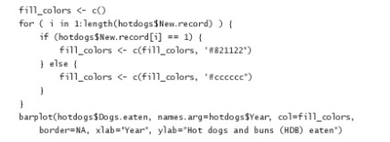
Consider something as simple as building a graph which illustrates the frequency of several discrete occurrences over time.  Nathan Yau does so in his “Visualizing Patterns over Time” chapter of Visualize This and demonstrates the steps taken in this process.  From recording the data, to organising it within a spreadsheet, to writing the code that will command the software to build the visualization.  There is a point in this process where one component of the data is this code (2004, 101):

Image

What does this data mean?  It tells us nothing of what the end visualization will look like as we cannot see the original data nor the software which will be used to create the visualization.  However at this point it is one of three ‘parts’ needed to construct the bar graph.  Does it have no value to us alone?  Or can it tell us of the authors intentions and the construction of his narrative?

This question becomes even more complicated in this temporal visualization of the film The Iron Giant.  Kevin L. Ferguson, Assistant Professor in the Department of English, CUNY illustrates the process of converting a film to data that can then be visualized in his blog.  He breaks the film into over 100,000 frames, classifies each of them within Excel and then creates visualizations based on a number of different factors.  This example plots length of shot against the timeline of the film:

Image

These examples highlight the transformative steps taken to visualize data.  But how does this process equate to that of traditional historical chronologies?

Week 2: Readings

22 Sunday Sep 2013

Posted by nicolemeehan in Uncategorized

≈ Leave a comment

As a museum type person I found one common theme in the readings to be of particular interest.  That was that many writers recognised that the increase in popularity of visualisations in the digital humanities necessitated that scholars old and new be taught how to ‘read’ and ‘write’ them (Burdick, 10).  This awareness can be seen throughout the readings with Jessop and Foster suggesting that ‘reading’ visualisations should be taught in classrooms as a component of the core curriculum (Jessop, 288) (Foster, 32).  I think that this is of vital importance.  If we are to utilise such tools successfully in museums or academia we must ensure that they are accessible and understandable.

In addition to this we might also think about how new approaches or tools in the digital humanities may be received by wider audiences.  I found the idea of ‘distant reading’ to be intriguing but it seems from this article printed in The New York Times in June 2011 that not everyone is convinced.

Distant reading of Hamlet Diagram

A diagram produced by the Stanford Literary Lab from a distant reading of Hamlet

I think this neatly demonstrates the need not only to teach the public how to ‘read’ these tools but to explain their potential in a meaningful way, perhaps through real-world examples.  This could even serve to involve more people in the digital humanities, making collaborations such as those described by Sprio and the Young Researchers in Digital Humanities manifesto possible.

Week 1 Reading

15 Sunday Sep 2013

Posted by nicolemeehan in Uncategorized

≈ Leave a comment

Reading this combination of articles made me consider the very nature of the data that we attempt to visualize.  In her writings Drucker draws attention to the difference between data and information.  Data is the raw product of statistical analysis whereas interpretation(more commonly used within the realm of the humanities) has inherently undergone a process of interpretation (Drucker, 10).  Can we therefore use the same visualization methods used in the sciences for the humanities?

It was also made clear that we must understand exactly what we are visualizing and why we are visualizing it.  By doing this from the beginning we are more equipped to present data/information to audiences in a meaningful way.  And as Stafford says it is our responsibility to ensure that the public have the tools to understand our visualizations (Stafford, 462).  A possible method for accomplishing this, as Yau suggests, is to approach each visualization as a story, one that must have a narrative (Yau, 35).  

By looking at the forms graphical representations have taken in the past Drucker highlights the array of techniques that can and have been used ( Drucker, 21), and points towards an abundance of possibilities in the future. The availability of free open source software has increased the use of visualization in the humanities and places the responsibility of ensuring that it is correct, effective and useful firmly on the visualizers shoulders. 

The Ben Jonson project is an example of a initiative that placed digital at its centre from the outset.  In 2009 the journal of poet and dramatist Ben Jonson was discovered in the Cheshire Archives.  It recorded his 400 mile walk from London to Edinburgh.  The University of Nottingham and the University of Edinburgh collaborated in creating an interactive project to bring this insight into 17th Century life to the public.  They created a WordPress blog and tweeted his journey in real time, linking to photographs of his whereabouts and typed excerpts from his journal.  This is a successful endeavor, but I wonder how visualization (in addition to the interactive map) could assist in achieving their objective.

← Older posts

Enter your email address to follow this blog and receive notifications of new posts by email.

Join 25 other followers

Authrs

  • alessandrocarpin
    • Flip-Flop
    • More dimensions, more opportunities
    • Text, database, narrative
    • Collections, landascapes (and video games)
    • Networks and Methodology
  • danielhjohnson
    • 3-D Modeling and Printing
    • Digital Humanities in A/V Archives
    • Week 9: 3-D Immersion
    • Interpreting Genre
    • Interface vs. Content Management
  • gigipollo
    • Project is here
    • learning from touch with identical artifacts,
    • Archiving the Present
    • DIgital Storytelling
    • Computational Culture
  • hnbrady
    • Week 3 Thoughts
    • Week 2 Readings
  • jabauer
    • Open Lab Today 3 – 5pm
    • Jean speaking at Joukowsky Tomorrow (Thursday, October 31) 12pm
    • Data for Today
    • Timeline.js Pros and Cons
    • Change to Lab Schedule
  • Galehault
    • Remember, Today Sarah McPhee’s lecture on Virtual Rome, List 110, 5:30PM
    • Eco on Fakes
    • Uncertainty and (3D) mapping
    • Bernie Frischer on 3D Archeology
    • Graphs, Maps, Trees
  • nicolemeehan
    • Process as value
    • Layers of interpretation
    • Text – Image – Digital
    • Collections – Databases
    • Network Analysis – Nicole
  • D. Brown
    • Today’s little bug?
    • Teaching in 3D
    • Teaching in 3D
    • Collections
    • networks
  • Steven Lubar
    • Call for Papers: Lost Museums Colloquium
    • Information Visualization MOOC
    • Reminder: No class today
    • Reminder, no class today. Presentations next week.
    • No class 11/25
  • vfederici2013
    • Making anew
    • Mediation, hierarchy, authorship
    • Objective truth
    • Visual narratives: text as image
    • Collectible Knowledge
  • yuanyuandai
    • Re- think, Re- make
    • 3D visualization for humanities
    • Interpreting Database
    • Networks and Humanities
    • Yuanyuan’s post week4
  • zoelanger2013
    • Authorship and reproduction
    • Thoughts about reconstructions
    • Categories, Narrative, and Data in Literature
    • Thinking about classification
    • Thinking critically about maps – Zoe

class mechanics class notes for class this week Uncategorized weekly writing

Meta

  • Register
  • Log in
  • Entries feed
  • Comments feed
  • WordPress.com

Create a free website or blog at WordPress.com.

  • Follow Following
    • AMST2661 Visualizations in the Humanities
    • Join 25 other followers
    • Already have a WordPress.com account? Log in now.
    • AMST2661 Visualizations in the Humanities
    • Customize
    • Follow Following
    • Sign up
    • Log in
    • Report this content
    • View site in Reader
    • Manage subscriptions
    • Collapse this bar
 

Loading Comments...